> ## Documentation Index
> Fetch the complete documentation index at: https://docs.chaintable.com/llms.txt
> Use this file to discover all available pages before exploring further.
# Visualizations and dashboards
> Configure charts from SQL results and build a dashboard containing them.
A visualization defines how a query result is displayed. A dashboard combines visualizations on one page. First save and run a [SQL query](/guides/analytics/sql-queries).
This example uses the query from [Query token daily transfers](/quickstart/use/daily-token-transfers), which returns `day` and `transfer_count`.
## Create a chart
1. Click **New** above the query results.
2. Select **Bar Chart**, then open the new **Bar Chart** tab.
3. Under **Result Data** on the right, set **X Column** to `day` and **Y Column 1** to `transfer_count`. If already selected automatically, confirm the mapping.
4. Check that dates run along the horizontal axis and transfer counts along the vertical axis.
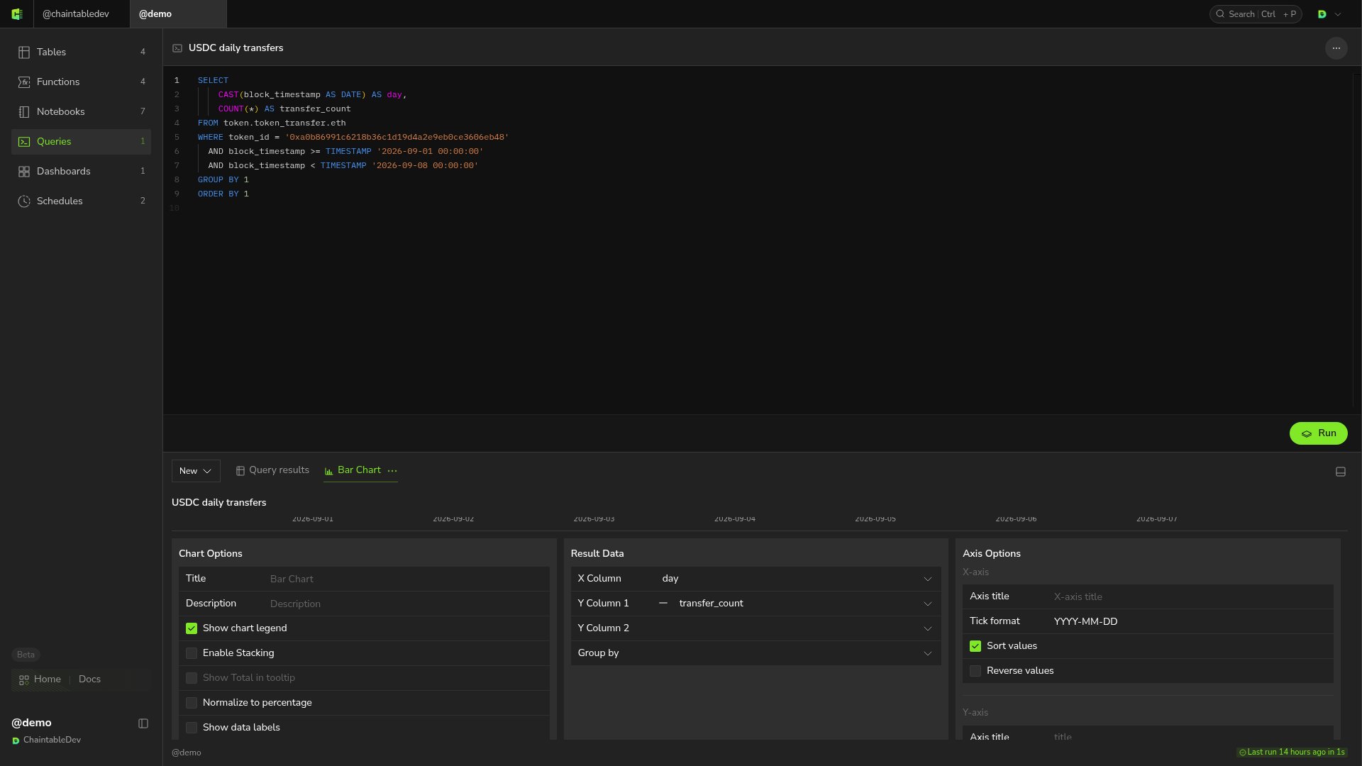 **New** also offers line, area, scatter, and pie charts, counters, and tables. Choose a format for the result: line or bar charts suit time trends, while counters suit a single total.
**Chart Options**, **Axis Options**, and **Series** on the right configure the legend, axes, and data series.
## Create a dashboard and add the chart
1. Return to **Dashboards** in the Space and click **+** in the upper right.
2. Enter `USDC activity` in **Dashboard name**, set the URL path to `usdc_activity`, and click **Save and open**.
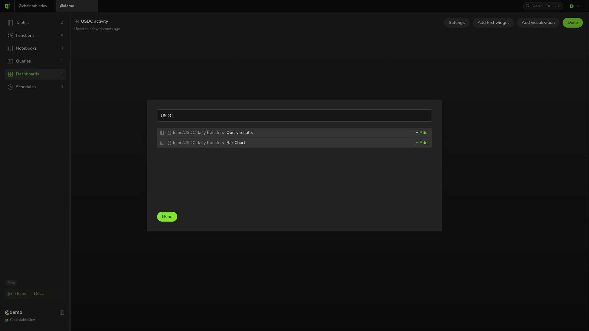
3. Click **Edit → Add visualization**.
4. Search for `USDC`, find **Bar Chart** under `USDC daily transfers`, and click its **+ Add** button.
5. Click **Done** in the selection dialog, then **Done** on the dashboard to finish editing.
**New** also offers line, area, scatter, and pie charts, counters, and tables. Choose a format for the result: line or bar charts suit time trends, while counters suit a single total.
**Chart Options**, **Axis Options**, and **Series** on the right configure the legend, axes, and data series.
## Create a dashboard and add the chart
1. Return to **Dashboards** in the Space and click **+** in the upper right.
2. Enter `USDC activity` in **Dashboard name**, set the URL path to `usdc_activity`, and click **Save and open**.
3. Click **Edit → Add visualization**.
4. Search for `USDC`, find **Bar Chart** under `USDC daily transfers`, and click its **+ Add** button.
5. Click **Done** in the selection dialog, then **Done** on the dashboard to finish editing.
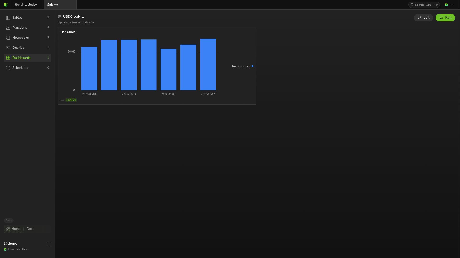
 The dashboard now shows the daily transfer bar chart. Reopening it preserves the layout and chart.
 ## Edit and update
Click **Edit** to add more visualizations, add explanations through **Add text widget**, or change dashboard configuration through **Settings**. Click **Done** when finished.
Charts use the results of their linked queries. Rerunning a query updates the data shown in its charts and dashboards.
## Edit and update
Click **Edit** to add more visualizations, add explanations through **Add text widget**, or change dashboard configuration through **Settings**. Click **Done** when finished.
Charts use the results of their linked queries. Rerunning a query updates the data shown in its charts and dashboards.