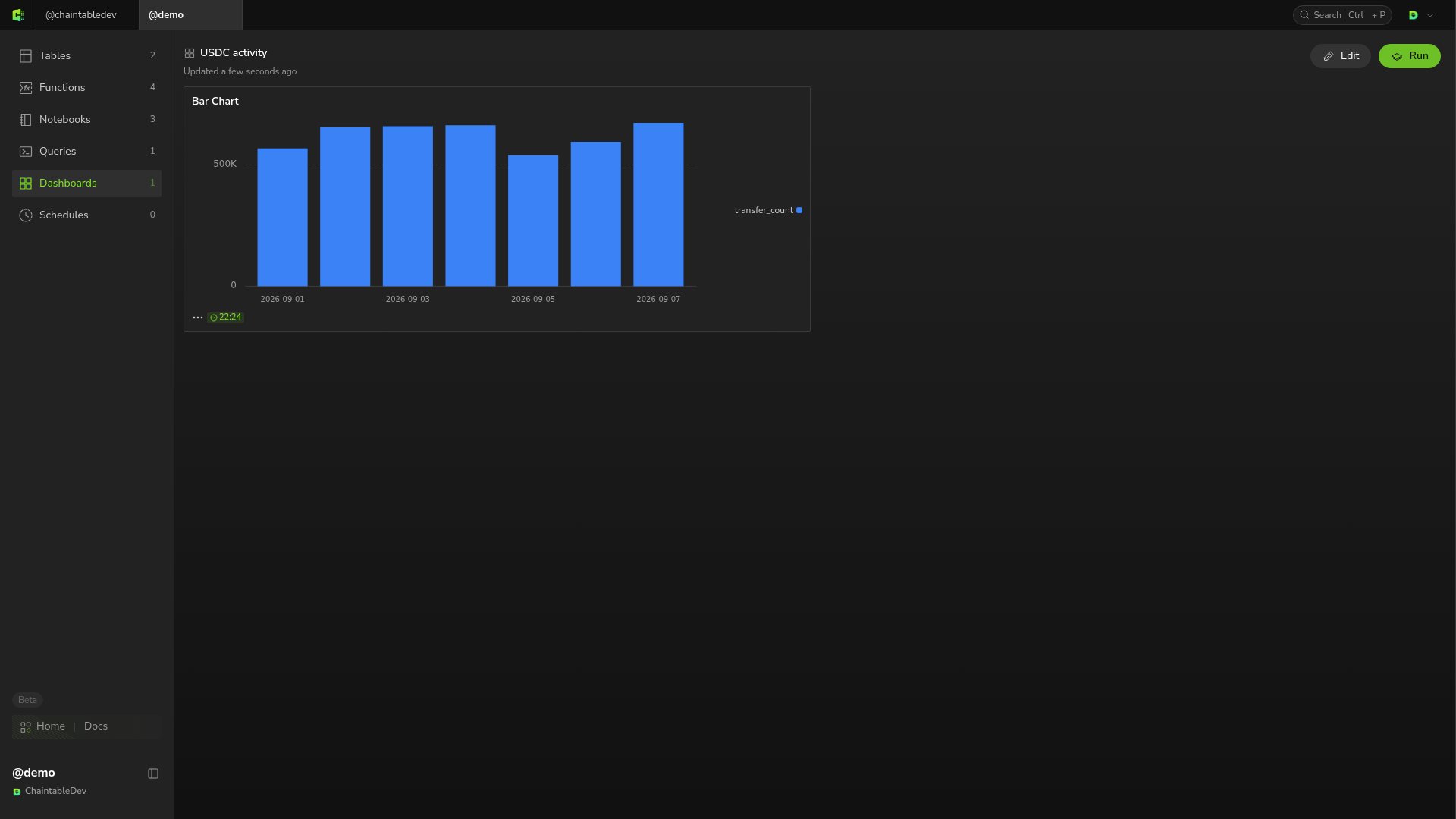
A visualization defines how a query result is displayed. A dashboard combines visualizations on one page. First save and run a SQL query. This example uses the query from Query token daily transfers, which returns day and transfer_count.

Create a chart

  1. Click New above the query results.
  2. Select Bar Chart, then open the new Bar Chart tab.
  3. Under Result Data on the right, set X Column to day and Y Column 1 to transfer_count. If already selected automatically, confirm the mapping.
  4. Check that dates run along the horizontal axis and transfer counts along the vertical axis.
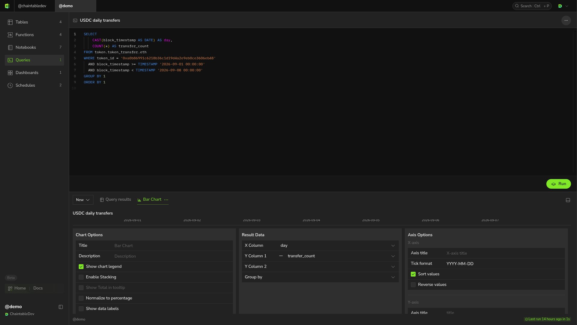
Bar Chart maps day to X and transfer_count to Y
New also offers line, area, scatter, and pie charts, counters, and tables. Choose a format for the result: line or bar charts suit time trends, while counters suit a single total. Chart Options, Axis Options, and Series on the right configure the legend, axes, and data series.

Create a dashboard and add the chart

  1. Return to Dashboards in the Space and click + in the upper right.
  2. Enter USDC activity in Dashboard name, set the URL path to usdc_activity, and click Save and open.
  3. Click Edit → Add visualization.
  4. Search for USDC, find Bar Chart under USDC daily transfers, and click its + Add button.
  5. Click Done in the selection dialog, then Done on the dashboard to finish editing.
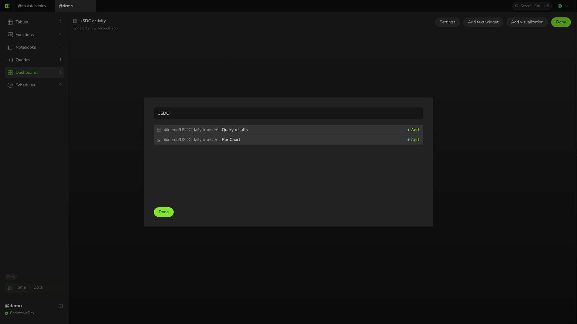
Search for the USDC query and add its Bar Chart to the dashboard
The dashboard now shows the daily transfer bar chart. Reopening it preserves the layout and chart.
USDC activity dashboard shows daily USDC transfer counts

Edit and update

Click Edit to add more visualizations, add explanations through Add text widget, or change dashboard configuration through Settings. Click Done when finished. Charts use the results of their linked queries. Rerunning a query updates the data shown in its charts and dashboards.